Track Lights
 Linear Lights
 Track System
 Decorative Lights
 Recessed Light
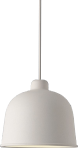
 Pendant lights
 Surface mounted lights
 Panel lights
 Street Lighting
 Magnetic Lighting System 48V
 Magnetic Lighting System 48V
 Invertors
 Lighting control
Colour temperature of light: what it affects and how to use it

Light can shape space and atmosphere and influence mood and how objects are perceived. When choosing the colour temperature of lighting, remember that warm light makes yellows and reds brighter and "warms" a space, while cool light works better with greens and blues and seems to cool a room down.
Colour temperature of light sources
Below is what you need to know about the correlated colour temperature (CCT) of light sources and how to use it depending on the interior and the task.
Colour temperature describes the apparent colour of the light a source emits and is measured in kelvin (K). The scale starts at about 800 K (the visible glow of hot bodies) and goes up to 20,000 K (the deep blue sky at polar latitudes). In lighting, the range from 1800 to 6600 K is used.
How is colour temperature related to the ordinary temperature we all know? Directly. The first incandescent lamps really did heat up to these values, but because of the materials only up to about 3000 K, more often less, so they produced only warm light. The rest of the range was added as the technology improved. Modern LEDs hardly heat up at all: they reproduce the appearance of light with the stated colour temperature.
There are three conventional colour temperature ranges:
- warm white: up to 3000 K;
- neutral (daylight) white: 4000 to 4500 K;
- cool white: 5000 to 6500 K.

Features and uses of warm white light
Warm shades of light are easy on the eyes, are associated with sunlight and create a comfortable, cheerful and calm atmosphere. In a bakery warm light gives the "fresh from the oven" effect and stimulates the appetite.
Meat counters use lighting with a pink tint to emphasise the freshness of the products.
Furniture shops: light brings out the texture of wood and fabric and makes the space feel cosy.
Children's shops: light creates a comfortable, relaxed atmosphere and suggests fun and celebration.
In public spaces warm light is used mainly in cafés, bars and restaurants, libraries, small general boutiques, food courts and some hospital wards. Street lights at the entrances to such venues and in parks often have this colour temperature too.
At home, light up to 3000 K is used in rooms finished in pastel, warm and soft tones: bedrooms, children's rooms and living rooms, places where people relax. Warm light also suits interior styles such as vintage, eco, rustic and classic, as well as any interior with a lot of wood and fabric.
In short: warm lighting is the best helper in creating a comfortable, cheerful and relaxing atmosphere. It flatters the texture of upholstered furniture, antiques and paintings. It is the best choice for gold items and gold tones, but works against silver, nickel and steel.
Features and uses of neutral daylight white
Daylight white, 3500 to 4000 K, is probably the most versatile choice, as it can be used almost anywhere. It does not change how colours are perceived or affect the psychological state; it simply does its job of lighting the space. That is why neutral white is the default in most places.

Features and uses of cool white light
Cool light, from 5500 K, works the opposite way to warm light. It stimulates and helps concentration but strains the eyes a little, so staying under it for a long time is not very comfortable. It also dulls warm pastel colours and, conversely, strengthens cool ones such as blue or green.
In shops cool light is used for household and other appliances, steel or silver jewellery, medical and other professional equipment.
In public spaces these colour temperatures are used especially often: in industry, offices, healthcare facilities, schools and other educational institutions, at stadiums and for road lighting.
At home this colour temperature is used less often because, as mentioned, it strains the eyes a little. But it is excellent for work areas and bathrooms. As for styles, cool light suits high-tech, minimalist and Scandinavian interiors, and any interior in cool tones with a lot of metal and plastic.
To sum up: a well-chosen colour temperature, and the right combination of light sources with different values, can strongly influence how people perceive a space. It is not a simple task, so it is best left to professionals, such as the Vision Lighting team. We know how to organise lighting zones and choose the optimal colour temperature, so get in touch.